Welcome to the final segment of Water Lines – Pen & ink; a post series showing my work from a group exhibition in December. Today, I want to introduce you to the Garnet Hill – a four masted steel barque with a (to me) special history.
Garnet Hill
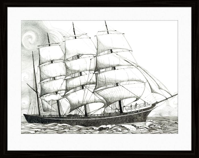
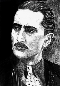
Carl, my great grandfather enlisted on the Garnet Hill as a seaman in 1912. Having already spent years at sea, he continued to work his way around the world covering vast expanses of ocean between each port. With so much resting on physical strength, sure-footedness and teamwork; each journey carried the very real risk of a sailor going overboard in stormy weather.
I wanted to capture the magic of billowing sails and rolling waves. A majestic beauty, which despite its underlying dangers, entices the hearts of sailors and seafarers to this day. I imagined what Carl would have felt in the midst of all the hard work on board; looking out across the waves with a strong breeze blowing in the sails …
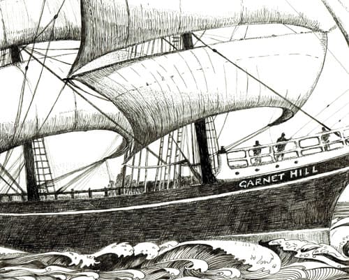
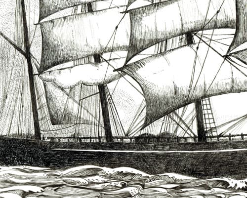
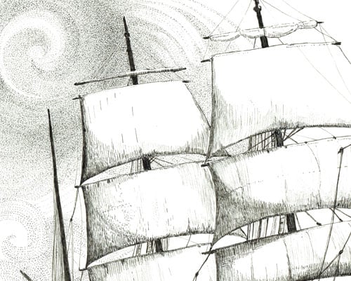
Pen & Ink materials used
When it comes to drawing materials (or any art supplies really), I feel like a kid in a lolly shop, just having them around. However, when pressed to choose between this one or that one, here are some of the things I look for in pens: As I draw a lot, I discovered that pens with cartridges (or refillable ink) and replaceable nibs go a long way compared to the disposable pens: My absolute favourite pens are Rapidograph – the ink is pure black (which I love) and the pen feels like real instrument in your hand, the ink flows beautifully and dries quickly, and when the ink stops flowing, cartridges are easy peasy to replace … The only catch is that the finest nib size (0.13) is difficult to keep ‘clog free’ – after wrecking a few of these super-fine nibs, I decided to try the Copic Multiliner SP in the extra fine nib sizes – 0.01 & 0.03 … (Anything from 0.18, which is still very fine, I’ll use Rapidograph). The Copic pens are good; the nibs wear out quite quickly, but they are a lot less expensive to replace compared to Rapidograph. The ink feels a little lighter compared to Rapidograph, though it falls on the pure black spectrum, which is important to me (I don’t like when ‘black’ ink leans towards purple or green or even brown)… :)
Paper
All the drawings in the Water Lines series are done on heavyweight (300gsm), acid free paper.
I hope you enjoyed this series – in case you missed a segment, I’ve included all the links below:
Water Lines – exhibition wrap and introduction
Pen & Ink Drawings – Part I
Pen & Ink Drawings – Part II
Pen & Ink Drawings – Part III
Thank you for visiting and take care!
Annette :)


Thank you for a lovely series of posts on your drawings. It has been extremely interesting to learn about all the ‘whys’ and ‘wherefores’ associated with each individual image.
Thank you so much – glad to hear :)