What is a Mock-up?
If you haven’t stumbled on the word mock-up before, this post may shed some light on both meaning and use. There’s a little background, a few examples, and even some trivia to whet your appetite :)
A mock-up can be a useful and creative way to illustrate a concept, as it can be used to demonstrate skills, functions and product ideas – before the actual design is settled on.
In design graphic, web, architecture… Mock-ups are used for:
- Showing a client what their new website could look like
- Showcasing skills, ideas and creative solutions
- Taking ideas from brain-storming to sample product prototypes.
- Illustrating web-based functions and link navigation as a way of ‘getting it right’
- Visually describing a building or concept within its intended environment
Examples of Design mock-ups for magazines
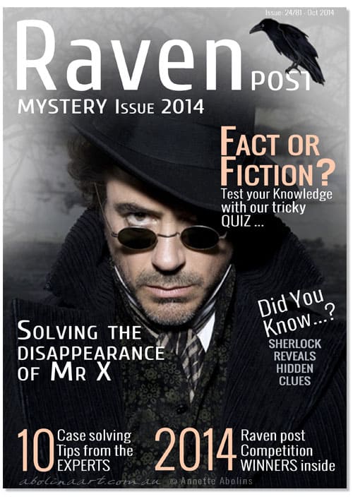
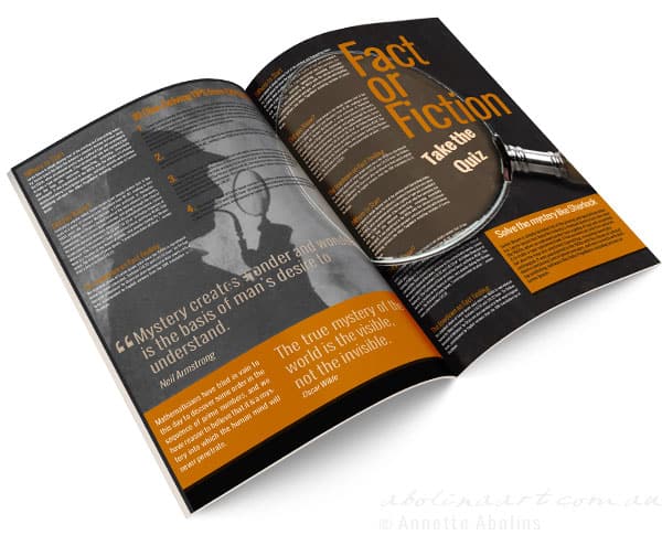
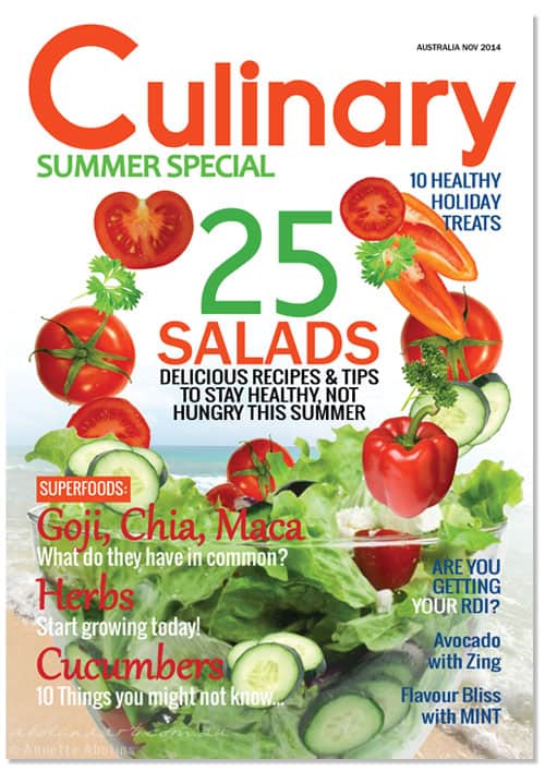
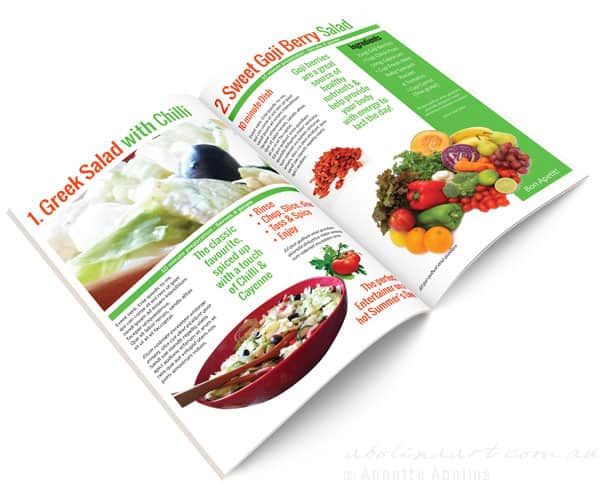
I designed these fictive magazine covers and inside spreads in inDesign and Photoshop, where the main idea was use fonts, colour schemes, images and layout to explore concepts that would appeal to different readers … In the design below, I incorporated a photo of Robert Downey Jr as Sherlock Holmes and my Raven illustration. Other images are either stock photos or my own – most of the images for the food magazine where taken while making salad one evening… :)
History and Trivia
A long time ago (pre digital era), my dad spent 2 years trying to convince the town architect to approve his building proposal. In the end, he decided that the only way he could convince the architect to relent, was to show him exactly how the building would look …
He spent days constructing a cardboard model of the building to scale, which he then placed in the field and photographed from several angles. He then developed the photographs and brought them along to show the architect…
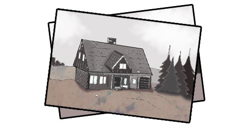
A very rough illustration of the ‘mock-up’ photographs
The architect almost fell off his chair … as he thought he was looking at the completed building! However, once the initial surprise settled, the mock-up provided something ‘real’ to discuss, which eventually led to the much anticipated approval.
At art school I had an inspiring teacher who encouraged us to make maquettes – small ‘sketch’ versions of our sculptures and artworks. To me, these maquettes were a fabulous way of exploring ideas and also showing the teacher what I had in mind, without having to ‘write it down’.
You could say that the maquette is similar to a design mock-up, as they are both about providing a visual representation of an idea or concept … a way to explain the pictures in your head. :)
How do you travel from idea to drawing board to finished concept?
Are you a visual thinker or do you find it easier to use words to explain your ideas? Perhaps role-play or hands-on demonstration works best for you …? Or does something entirely different work for you?
Thank you for visiting
Annette :)


That was a fantastic post: I LOVED all your mock-ups (especially the Raven Post) The Culinary Magazine was also terrific – it was almost possible to taste the tomatoes and lettuce. I agree, it is a great idea to be able to ‘see’ how something might eventually look… You did a good job of the house photo.
Thank you so much, and for the house photo feedback too :) When a mock-up is intended to show design skills and ideas, rather than a suggested layout, there’s a lot of freedom, which I enjoy … I just hope Robert Downey Jr doesn’t mind being part of my mock-up ;)