Introducing the King of Spades
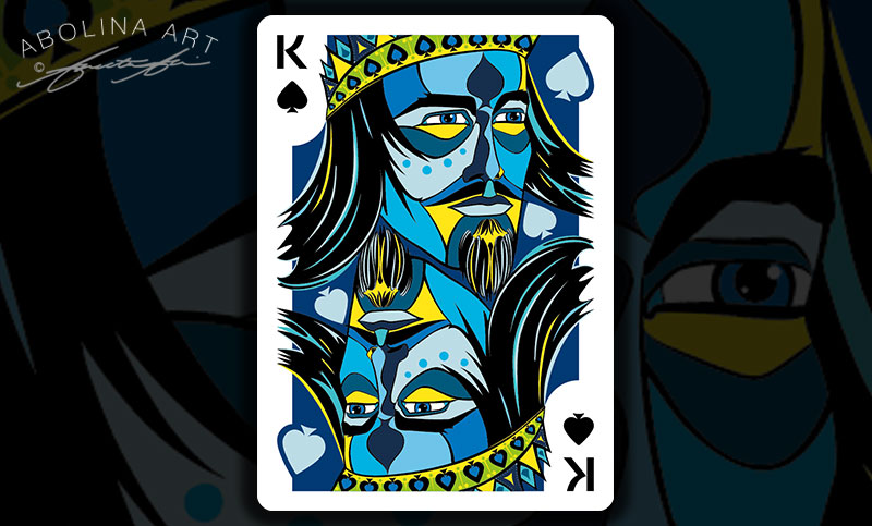
Re-working the Floating Pips
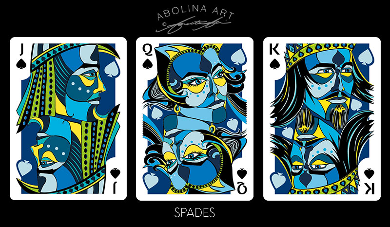
With a dark blue background and light blue ‘floating pips’ for the royal spades, I needed a different way to float the spades partially outside the coloured background (very light blue on edge white = not much contrast).
I tried borders, changing the colours (as in previous post), and finally, settled on extending the background where the pips float ‘outside’. At first, it seemed like a somewhat drastic change, but as i played around with it, the different elements seemed to hold together in a new way. Thinking of the artwork as having 3 tiers in order to create depth:
- Background – a coloured tapestry, accentuating the royal house colour
- Middle – floating pips (suit symbols) appliquéd on the coloured tapestry
- Foreground – Line work and colours bringing out the Royal characters.
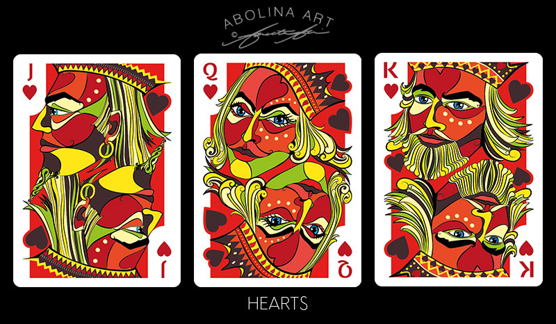
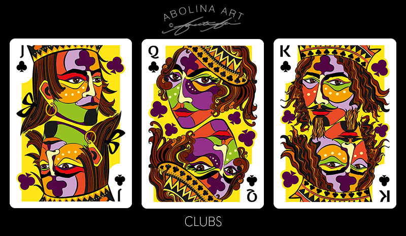
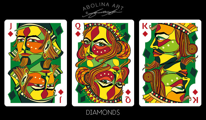
After applying changes to the spades, I went over hearts, clubs and diamonds – adjusting them to follow the same approach:
Naming a Deck of Cards
Names and titles are often elusive to me until the work is complete … yet to avoid a last minute panic, I thought I would share some of the ideas bouncing around, with a little background on where they come from – to see if any stands out as ‘the name’ (please be honest) :)
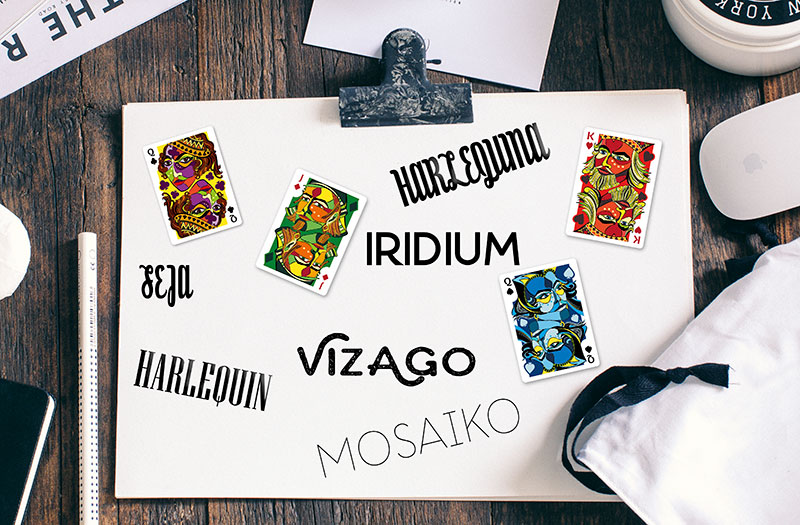
IRIDIUM – is a rare metal in the platinum family and the element with the highest resistance to corrosion in the Periodic Table of Elements. Named after the Greek goddess Iris (derived from the Latin word meaning rainbow), for the striking and diverse colours of its salts.
There are such beautiful names for colours (Vanadium, Aquamarine, Cerulean, Tangarine, Vermillion … ), yet choosing one colour to represent many didn’t seem quite fair in this case … As many are derived from metal oxides, I searched the periodic table of elements for an element which could represent all colours – and found Iridium … [This metal oxide can be used to enhance colours and ceramic glazes, and, with its impressive resistance to corrosion and high melting point – above 2000 degrees Celcius, it is also common in ceramic refractories.]
The drawing/painting style comes from my love of drawing faces loosely inspired by cross-contour drawing …. My whimsical ‘face’ teapots (which sparked inspiration for this deck), involved the use of metal oxides, glazes and high-temperature firings, which in a way brings a ‘rainbow metal name’ into focus…
Following the journey into the world of chemistry I looked for more descriptive names … names that could describe face and/or colour:
HARLEQUIN – a reference to the fanciful, multicoloured and jester like nature of the courts
HARLEQUINA – same as above but with a feminine touch
MOSAIKO – inspired by stained glass, mosaic and colour, although… I just did a search online and discovered it’s also a no-bake cake (!)
VIZAGO – Esperanto word meaning face. I like the idea of a global language and a name that describes what the deck is about.
SEJA – inspired by my background, Seja is the Latvian word meaning face
HARLEQUIN draped in colours and fun has been at the top of the list for a while, along with my other favourite; IRIDIUM … Recently, though I’ve had several recent votes for VIZAGO, which I have to admit I am warming to … I would love to hear your favourite in the comments below :)
Moving on to Aces and Number cards …
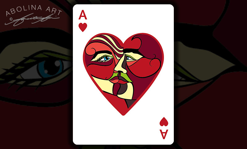
The theme of faces continues throughout the deck and the Ace of Hearts has two faces framed within. The colour scheme follows that of the royal hearts, with the emphasis being on red.
There will be some tweaks before I’m happy, but here’s version 1:
10 of Hearts – A Work in Progress …
My initial thought was to maintain the detail from the Ace in each of the number pips, though I’m still playing around with different ideas to see which works best.
1. Identical to the Ace
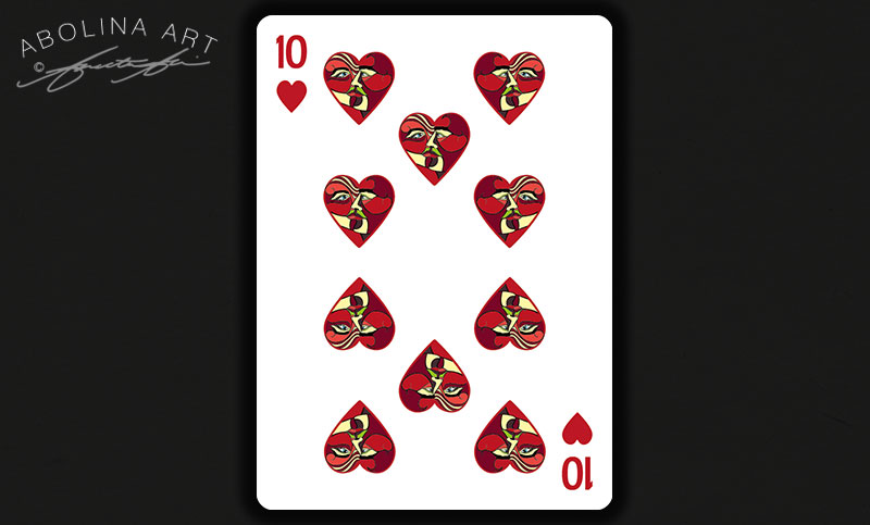
2. Scaled back amount of detail in faces
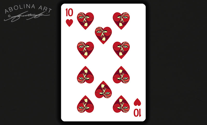
3. Contrast variation – more within the red spectrum
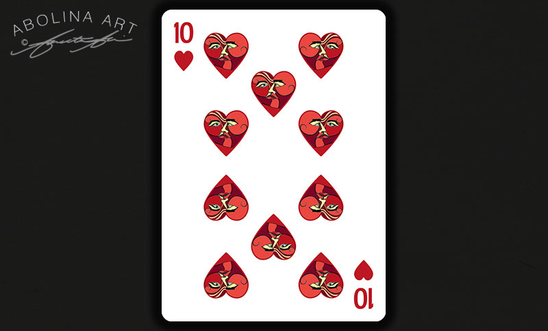
In the versions above I’ve mirrored the hearts (left to right) as well as rotated (top to bottom).
Below, the hearts are not mirrored, yet still rotated to maintain the 2-way view:
4. Subtle – red hues and even less detail
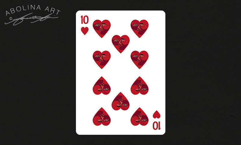
5. Dark accents and emphasis on eyes
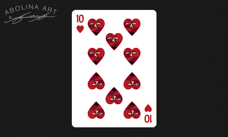
6. Mixed pips – 2 detailed with the rest solid red
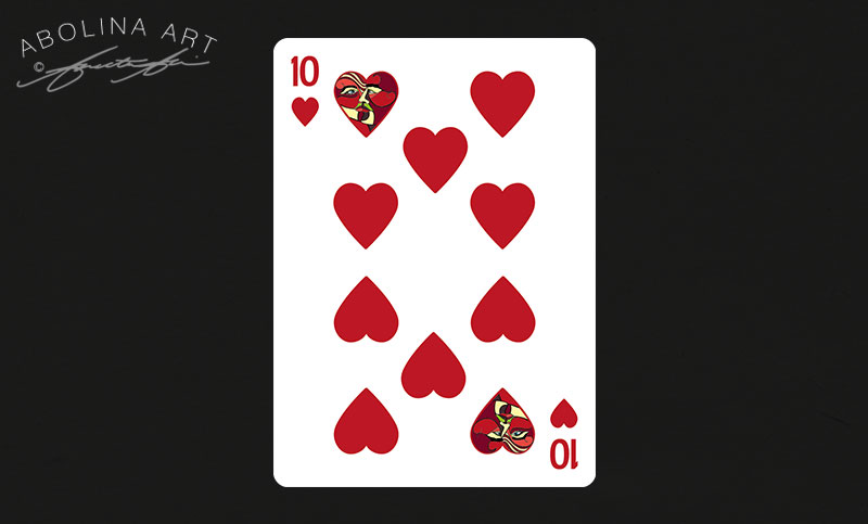
Thanks for visiting – and if you have thoughts on name or versions – I’d love to hear!
Annette :)


Oh, my goodness! There was a lot to comment on this time. First of all, I feel that your re-working of the pips has resulted in a great solution. Extending the colour ‘outside’ works particularly well and pulls everything together into a unified image.
Regarding the name of the deck. I can understand your liking for Seja, but I’m wondering as to how most people would pronounce it… I don’t particularly like Harlequin (a) (but that’s just me), and the same applies to Mosaiko. On the other hand, I quite like Vizago (and given the fact that the word means ‘face’ in Esperanto its inclusion as a possible name is definitely validated.
Finally the cards. It was a difficult decision, but I would probably go with either 1 or 6.
You are doing a fantastic job – I can’t wait to see the finished cards.
Thanks so much Diane :) I’m leaning towards naming the deck Vizaĝo – with the little roof over ‘g’ it’s definitely a ‘soft’ g – like in ‘large’. As far as the Aces and number cards go, I’m still on the drawing board… Glad to hear you’d choose 1 or 6, as to me that says if I can get the ace where I want it, the pips should hopefully follow :)