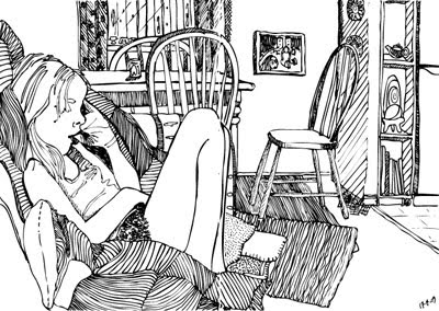
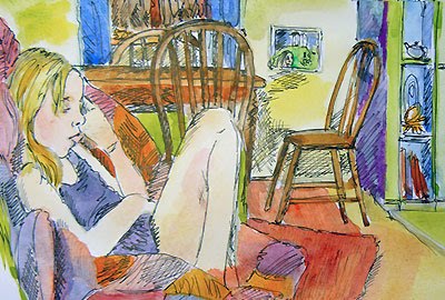
An illustration can take on a completely different look and feel depending on what you do with it. I’ve had a little play around with a drawing I did of my daughter sitting on the lounge. The original is a pen & ink line-drawing, and although it doesn’t really follow the rules of cross-contour (where you use continuous lines rather than cross-hatching and or tone to show form), it was partly what I had in mind :)
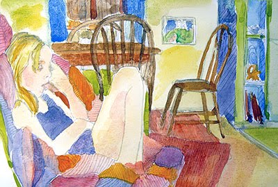
This is a very rough and quick watercolour test, which I did after scanning the original drawing & reducing the opacity to print showing only feint lines. Because of the paper being anything but designed for watercolour there was a bit of pooling going on, though I figured for a quick play (and a slight dose of impatience) it was worth it.

Until next post – stay well!
Annette :)


Hey Annette I didn’t know you had a blog!
Following it from now on!
Awesome :) thanks Johan, great to have you visit – blog is a baby as yet (as in one day old!) but the idea was prompted by your own advice a while back, so thanks ever so much for both suggesting and then following!
cheers :)