Colour brightens our days, conveys messages and can even set the tone in a deck of playing cards. If you change the colours around, the same design and artwork can take on a completely different look.
Playing cards are often released with a second colour version for the back and box design, which got me thinking about what Nine Lives Playing Cards would look like suited up in green (and a bit of black). This is very much in my ‘ideas’ basket and not a plan for an actual deck (yet)… though as I kept screens for (some of) the different versions along the design path, I thought it could be fun to share them here.
Playing around with a second colour version: Green

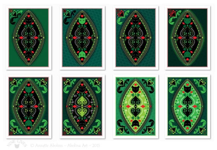
I started off with the idea that the centre and cats would be black (with an outline to define the shape of the cats’ heads… Though, when considering that very dark colours do have a habit of ‘bleeding’ together, I decided to keep going…
A design might look great blown up large on a screen (where you see all the detail), however, the printed result (especially when we’re talking about something as small as a playing card), may prove disappointing if there is too much detail, too little contrast, or other things that get lost in translation. I’ve found that looking at variations in ‘thumbnail’ size can provide a more truthful picture of how a printed card back may look.
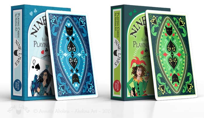
On the journey of colours I played with variations to background, centre and the smaller elements… The ‘final’ version (below) has more contrast and a combination of colours that would also resonate with the blue design:

Deck Design Contest Update:
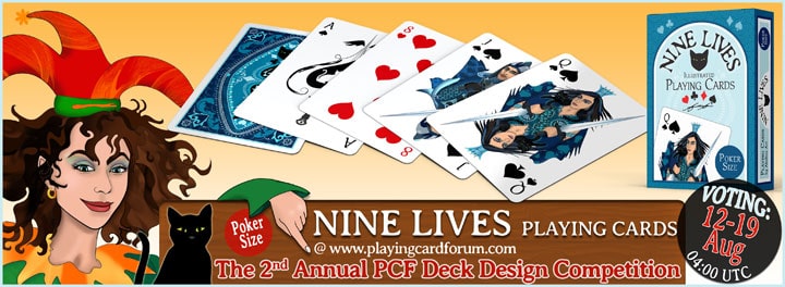
Voting is currently in progress for the The 2nd Annual Deck Design Competition, closing tomorrow (19th) at 04:00 UTC – Last chance to vote for your favourite:
Thank you for visiting and take care
Annette :)


I have now voted (this time it actually worked!).
The green/black backs are interesting, and although the darker ones are attractive it is obvious that they do not really work, especially given the fact that the cat needs to stand out. I liked the mock up though (with the slightly lighter green colours).