In this post I thought I’d show two of the latest websites I’ve been working on. Earth vs Water – Gardening vs Swimming… both different, but in some ways similar – as in they both promote a healthy ‘outdoorsy’ way of life… Something I find very easy to resonate with :)
Gosford Stingrays Swimming Club
The local swimming club is a friendly place with great kids (and adults) and a nice atmosphere for both racing, swimming and hanging out… As a committee member, I recently took on the voluntary role of managing Design & Publications, a job which suits my line of work, as I can fit in bits and pieces amongst other things I’m working on :)
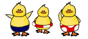
I started off with information posters, advertising the club at the local pool and providing information about the upcoming Summer season. I wanted something water related, something fun and eye-catching… The idea of lane ropes just popped into my head, I’d say that they were most likely inspired by the new lane ropes at the pool, don’t ask where the ducks came from… they can be most persistent ;) The illustrations are done using a mix of pen & ink (ducks), Illustrator & Photoshop (poster fonts, colours, lane ropes etc)…
![]()
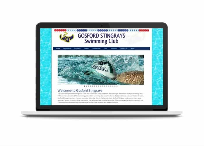
After designing the posters, it was time for the website, which I had agreed to give a face lift. A number of design elements (ducks included) made the journey from print media to screen… It is all about swimming fast as far as ducks are concerned. For me, it was more about incorporating the same visual language across several platforms. The website now has a fresh new look; with a water background (painted seamless pattern in Photoshop), a new banner and navigation menu, with updated fonts, colours and styles across the site.
Live Lawns & Gardens
I recently did a website for a local gardening business run by Carl at Live Lawns & Gardens. As a freelancer, I have had the pleasure of working with fabulous people and Carl is absolutely one of them – what a pleasant and easy guy to work with! I truly enjoy that space where ideas bounce and come together and everyone is happy; when a client provides good feedback every step of the way, it makes the job so much more inspiring.
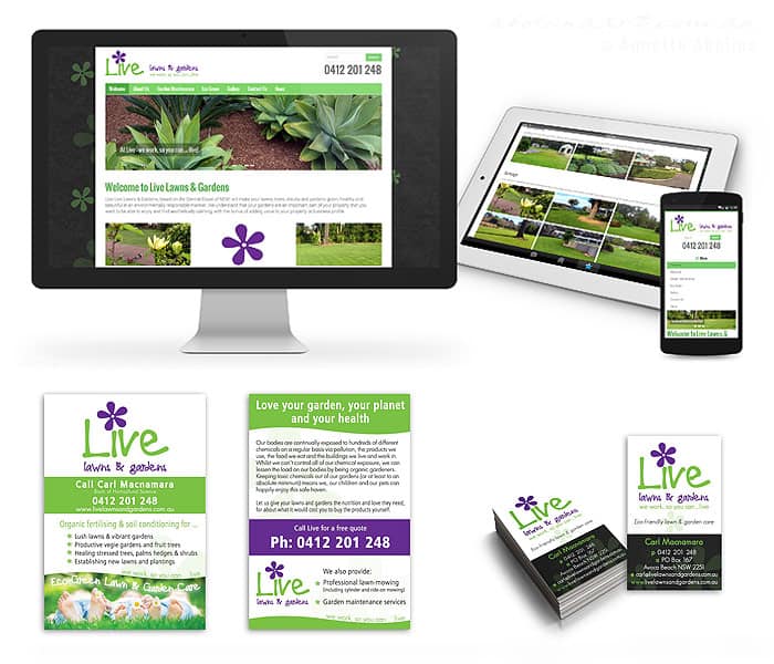
The main purpose of this website was to showcase the variety of work that Live Lawns & Gardens do… Photo galleries, banner slide shows, and a colour scheme that resonates with the business image and logo. The site itself is simple and easy to navigate, promoting a physical business (i.e. not an online business), where the website functions as a point of contact and information source for both new and existing customers.
In addition to the website I also designed print media: a flyer and the new business card:
These projects are in my design portfolio as well, where you can view other examples of my work. If you need help with a new website, or some TLC for your existing website… Drop me a line and tell me what you have in mind – as I’d love to hear from you :)
Annette :)

I LOVE the ducks…
I will tell them – it’s likely to go to their heads, but I know they will be thrilled to hear :)