My new deck of playing cards is growing with the fourth suit starting to take shape. Time for the Jack and Queen of Spades to make their entrance … The spades are defined by a palette, which moves through shades of blue. To me, this palette brings a sense of clarity to the characters, alluding to the element Air, and wisdom associated with the cards.
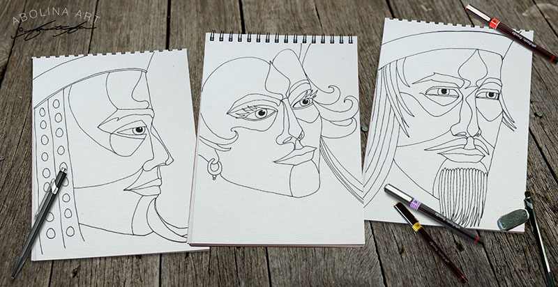
Line Drawings – the Royal Spades
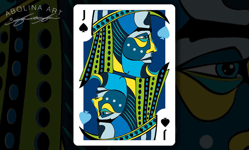
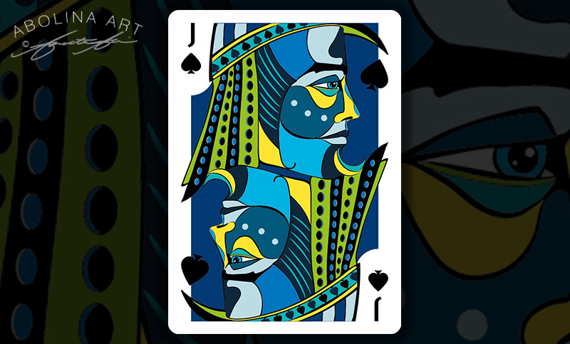
I’ve played around with two colour versions for the ‘floating spades’ within the artwork: dark vs light. Still not sure which one I’ll end up going with. My concern is that black spades on dark blue may ‘disappear’ too much in printing, but if the black/blue combination is printable I think it is my preferred one – what do you think?
Jack of Spades – Two Versions
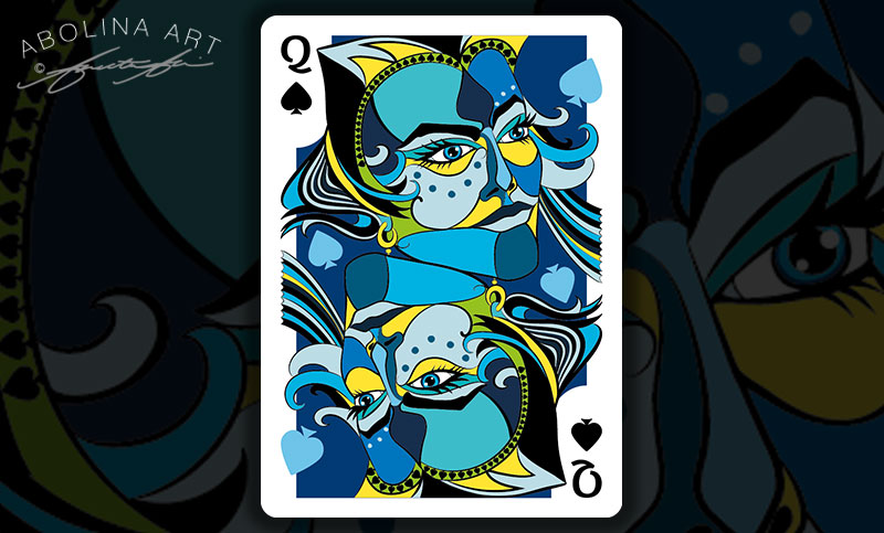
Queen of Spades – Two Versions
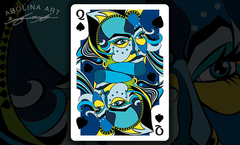
Coming soon: The King of Spades …
Thank you for visiting and take care!
Annette :)


I think I prefer the light-blue spades (it is a similar situation to the diamonds). Beautiful artwork.
Wow, thank you – I’ve had several people say they prefer the light blue spades and yes, I think after a few tweaks to the Queen (update to follow), light-blue it is :)