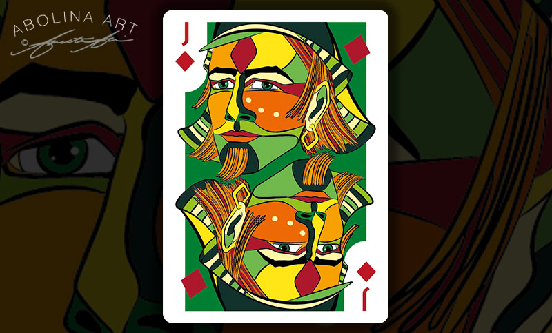
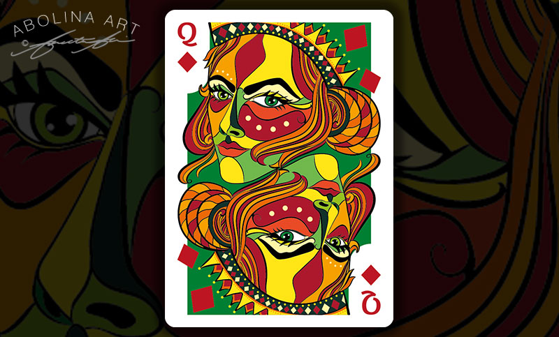
The Diamond colour palette is accentuated by green – and after a week of painting, three Diamond courts are excited to step on to the scene. I will be showing comparisons between the suits as this new (still unnamed) deck progresses, though if you want a sneak peek of the cards I’ve illustrated so far, here are links to the hearts and clubs
Pen and Ink Drawings of the Diamond Courts:
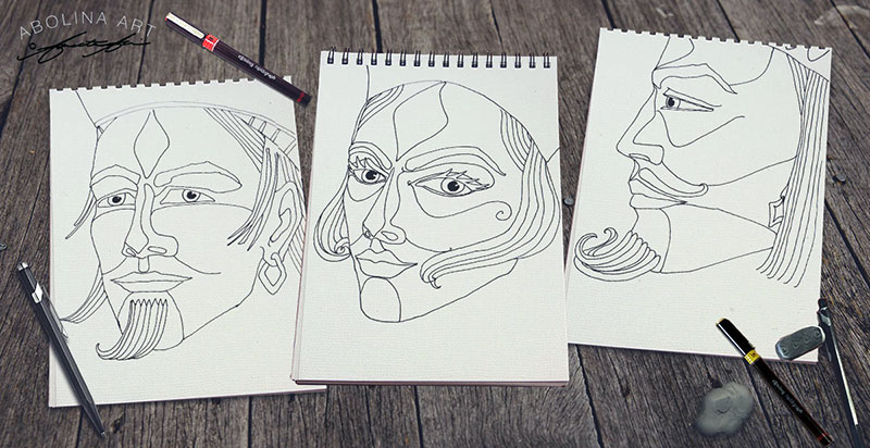
Jack of Diamonds
Queen of Diamonds
King of Diamonds
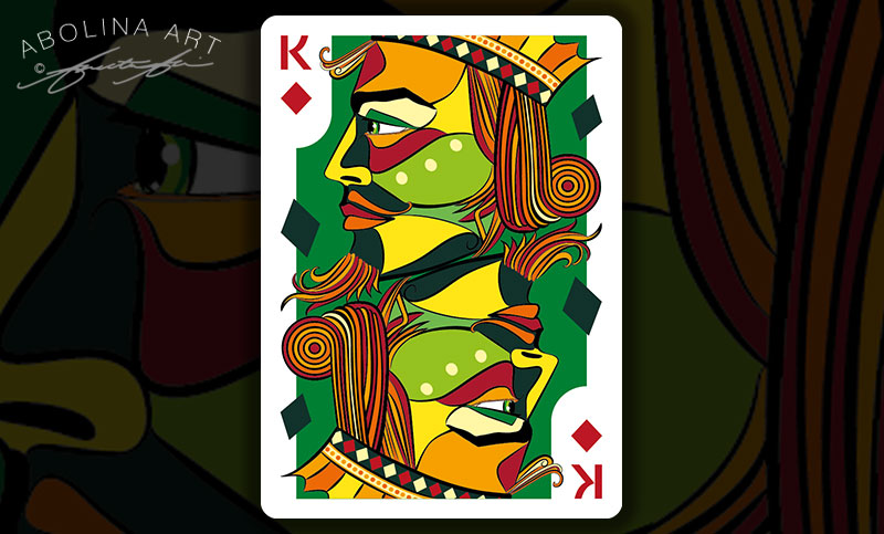
Colour of Floating Pips
The diamonds floating within the artwork on King of Diamonds are a dark green (and the shape is also more elongated) … I played around with a few different ideas – starting with red and moving towards the darker green, which I’m now leaning towards for all three diamond courts.
The idea is to use symbols and colour within the artwork to visually connect cards to their suit, while the indices in the top and bottom corner are there to provide an unambiguous description of the card. While I haven’t revised the Jack or Queen yet, I’d still love to hear your thoughts if you have a preference :)
Coming up next – a preview of the Spades …
Thank you for visiting and take care!
Annette :)



It is difficult to say which one looks best, but perhaps the dark green makes more sense. The red looks great, but there is a slight danger that red floating diamonds may obliterate the diamond symbol in the corner of the card. Am looking forward to hearing what the deck is going to be called…
Thank you Diane :) I think I’ll keep with the dark green – exactly like you say; the red diamonds seem to make the eye bounce between the indices and the artwork. Still a way off, but I am looking forward to finding the perfect name for this deck too :)