Hello all :)
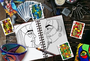
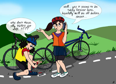
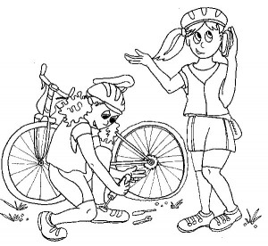
In between tarot cards I dived in and did a few drawings for a project I’m working on with a friend. The aim is to turn it into a book, so I’d best not give too much of the storyline away – though I think it’s safe to say the project focuses on dizzy girls and bicycles :) Posting work in progress can be a good way both to test the waters on ideas and also see things from a different perspective, which helps with the re-thinking or re-working process.
I am always trying to refine the process of getting from an ink drawing to a finished colour illustration, with the main obstacle being how to treat the scanned drawing :P Any tips, corrections or ideas are most welcome :)
My current process looks something like this (constantly changing as I find new ways):
- First I do a feint pencil sketch which I then ink over using a nice black pen
- I erase the pencil marks to avoid them being scanned
- Next I scan the drawing (into Photoshop) at 300dpi black and white
- I get rid of any marks that shouldn’t be there, convert from bitmap to grey scale >> RGB
(I’m not sure if this is right, as I’m beginning to think the initial line drawing should be saved as a bitmap?). - I then select everything white – (fuzzyness set to around 145) and cut the selected pixels to leave a black line drawing on a transparent background – this then becomes the line-drawing I work on for the colours.
- Once I’ve re-saved the file (with a different name so I have the original scan to revert to if needed), I create a layer below the line drawing and start painting – I use a variety of brushes to paint colour and add detail (changing colour mode and opacity as I go).
- I then make additional layers for highlights and shadows and more detail, generally dividing up the illustration to keep background and detail on separate layers.
- When done, I make sure I’ve saved the psd before flattening the document and save it as a high resolution jpg.
If anything above stands out as “OH NO” please let me know :) I’ve experimented with using the pen tool to trace the drawing – creating vector lines which have noooooo fuzzyness (is this the best way to go and should it be done in illustrator or Photoshop?). For fun I’ve also experimented with Illustrator live trace – but to me it feels like cheating (even though you can end up spend hours fixing up the drawing after tracing it…)… so after lots of experimenting; the list above is where I’m at now – happy to continue refining and learning!
Thanks for stopping by
Annette :)